Chapter 9: Plotting & Visualization#
Topics Covered:
Matplotlib basics for scientific plotting
Advanced plotting techniques for chemical engineering data
Molecular visualization with RDKit and Py3Dmol
What Makes a Good Scientific Figure?#
In science and engineering, figures are often the first thing readers look at — before even reading the text. A well-designed figure communicates your results clearly, while a poorly designed one can confuse, mislead, or undermine your credibility.
A good scientific figure should:
Stand on its own — a reader should understand it without reading the surrounding text
Communicate one clear message — avoid cramming too many ideas into a single plot
Key Principles#
Principle |
Why It Matters |
|---|---|
Appropriate plot type |
A bar chart for continuous data or a pie chart for comparisons can mislead. Match the plot to the data. |
Clear axis labels with units |
Without units, numbers are meaningless. Is it seconds or hours? Kelvin or Celsius? |
Readable font sizes |
If your audience has to squint, your figure has failed. Aim for 12+ pt for axis labels. |
Meaningful color choices |
Use color to convey information, not decoration. Avoid rainbow colormaps — they distort perception. |
No chartjunk |
Remove unnecessary 3D effects, excessive gridlines, and decorative elements that add no information. |
Legends and annotations |
When showing multiple datasets, always include a legend. Annotate key features when helpful. |
Error bars when applicable |
If your data has uncertainty, show it. Hiding uncertainty is misleading. |
Let’s look at a concrete example. Below, we plot the same dataset — concentration of a reactant over time during a first-order reaction — two ways: poorly and properly.
Bad Figure — What NOT to do:
import matplotlib.pyplot as plt
import numpy as np

# Data: first-order reaction, C(t) = C0 * exp(-k*t)
np.random.seed(42)
time_exp = np.array([0, 1, 2, 3, 4, 5, 6, 7, 8, 9, 10])
C0, k = 5.0, 0.3
C_exp = C0 * np.exp(-k * time_exp) + np.random.normal(0, 0.15, len(time_exp))
C_model = C0 * np.exp(-k * np.linspace(0, 10, 100))

# --- BAD FIGURE ---
plt.figure(figsize=(6, 4))
plt.plot(np.linspace(0, 10, 100), C_model, color='lime', linewidth=0.5)
plt.scatter(time_exp, C_exp, c=range(len(time_exp)), cmap='rainbow', s=200, marker='D')
plt.title('data', fontsize=8)
plt.xlabel('x', fontsize=7)
plt.ylabel('y', fontsize=7)
plt.xticks(fontsize=6)
plt.yticks(fontsize=6)
plt.ylim(-2, 12)  # misleading axis range — exaggerates empty space
plt.show()
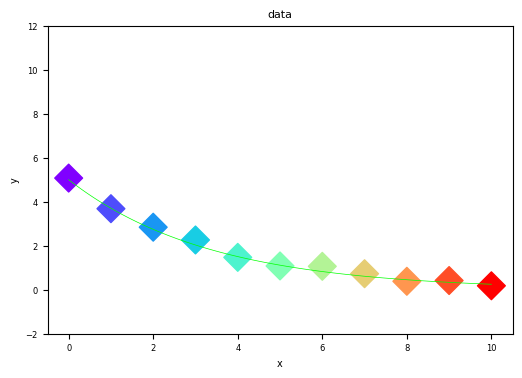
Problems with this figure:
No meaningful axis labels — “x” and “y” tell the reader nothing
No units — is time in seconds, minutes, or hours?
Tiny fonts — labels and tick marks are hard to read
Rainbow color scheme on scatter points — color encodes nothing useful here (just index)
No legend — what do the line and points represent?
Misleading y-axis range — extends to -2 and 12, making the data look smaller than it is
Thin model line — nearly invisible against the data
Good Figure — The same data, plotted properly:
# --- GOOD FIGURE ---
# Same data as above
np.random.seed(42)
time_exp = np.array([0, 1, 2, 3, 4, 5, 6, 7, 8, 9, 10])
C0, k = 5.0, 0.3
C_exp = C0 * np.exp(-k * time_exp) + np.random.normal(0, 0.15, len(time_exp))
time_model = np.linspace(0, 10, 100)
C_model = C0 * np.exp(-k * time_model)

noise_std = 0.25
yerr = np.full_like(C_exp, noise_std)


plt.figure(figsize=(8, 5))
plt.plot(time_model, C_model, 'b-', linewidth=2, label='Model: $C = C_0 e^{-kt}$')
plt.scatter(time_exp, C_exp, color='red', s=60, zorder=3,
            edgecolors='black', linewidths=0.5, label='Experimental Data')

plt.errorbar(time_exp, C_exp, yerr=yerr,
             fmt='o', color='red', ecolor='black',
             elinewidth=1.2, capsize=3,
             markersize=7, markeredgecolor='black')

plt.xlabel('Time (min)', fontsize=13)
plt.ylabel('Concentration (mol/L)', fontsize=13)
plt.title('First-Order Reaction: Concentration vs. Time', fontsize=14, fontweight='bold')
plt.xticks(fontsize=11)
plt.yticks(fontsize=11)
plt.legend(fontsize=11)
plt.grid(True, alpha=0.3)
plt.tight_layout()
plt.show()
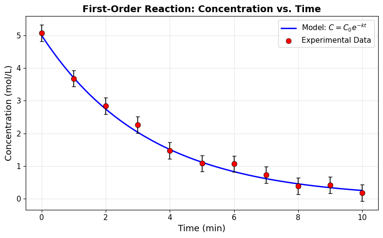
What makes this figure effective:
Descriptive axis labels with units — “Time (min)” and “Concentration (mol/L)”
Readable font sizes — 11-14 pt throughout
Distinct visual encoding — solid blue line for model, red circles for data
Legend — clearly identifies what each element represents
LaTeX in legend — shows the mathematical model equation
Appropriate axis range — matplotlib auto-scales to fit the data naturally
Subtle grid — helps read values without cluttering the plot
Quick Checklist for Scientific Figures#
Before submitting any figure, ask yourself:
Is the plot type appropriate for my data?
Do both axes have labels with units?
Is there a legend (if multiple datasets)?
Are fonts large enough to read?
Are error bars included (if uncertainty exists)?
Is the axis range reasonable (not misleading)?
Could someone understand this figure without reading the text?
9.1 Matplotlib Basics#
Matplotlib is the foundational plotting library in Python. It provides a MATLAB-like interface for creating high-quality visualizations.
import matplotlib.pyplot as plt
import matplotlib.pyplot as plt
import matplotlib.pyplot as plt

plt.figure()
<Figure size 640x480 with 0 Axes>
<Figure size 640x480 with 0 Axes>
plt.plot()
plt.show()
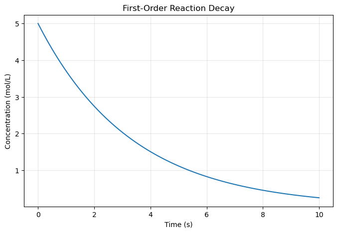
9.1.1 First Plot - Line Graph#
import numpy as np

# Create data
time = np.array([ 0.        ,  0.1010101 ,  0.2020202 ,  0.3030303 ,  0.4040404 ,
        0.50505051,  0.60606061,  0.70707071,  0.80808081,  0.90909091,
        1.01010101,  1.11111111,  1.21212121,  1.31313131,  1.41414141,
        1.51515152,  1.61616162,  1.71717172,  1.81818182,  1.91919192,
        2.02020202,  2.12121212,  2.22222222,  2.32323232,  2.42424242,
        2.52525253,  2.62626263,  2.72727273,  2.82828283,  2.92929293,
        3.03030303,  3.13131313,  3.23232323,  3.33333333,  3.43434343,
        3.53535354,  3.63636364,  3.73737374,  3.83838384,  3.93939394,
        4.04040404,  4.14141414,  4.24242424,  4.34343434,  4.44444444,
        4.54545455,  4.64646465,  4.74747475,  4.84848485,  4.94949495,
        5.05050505,  5.15151515,  5.25252525,  5.35353535,  5.45454545,
        5.55555556,  5.65656566,  5.75757576,  5.85858586,  5.95959596,
        6.06060606,  6.16161616,  6.26262626,  6.36363636,  6.46464646,
        6.56565657,  6.66666667,  6.76767677,  6.86868687,  6.96969697,
        7.07070707,  7.17171717,  7.27272727,  7.37373737,  7.47474747,
        7.57575758,  7.67676768,  7.77777778,  7.87878788,  7.97979798,
        8.08080808,  8.18181818,  8.28282828,  8.38383838,  8.48484848,
        8.58585859,  8.68686869,  8.78787879,  8.88888889,  8.98989899,
        9.09090909,  9.19191919,  9.29292929,  9.39393939,  9.49494949,
        9.5959596 ,  9.6969697 ,  9.7979798 ,  9.8989899 , 10.        ])
 #np.linspace(0, 10, 100)  # Time from 0 to 10 seconds
concentration = 5.0 * np.exp(-0.3 * time)  # First-order decay

# Create the plot
plt.figure(figsize=(8, 5))
plt.plot(time, concentration)
plt.xlabel('Time (s)')
plt.ylabel('Concentration (mol/L)')
plt.title('First-Order Reaction Decay')
plt.grid(True, alpha=0.3)
plt.show()
9.1.2 Customizing Line Styles and Colors#
Colors
Code |
Color |
|---|---|
|
Blue |
|
Green |
|
Red |
|
Cyan |
|
Magenta |
|
Yellow |
|
Black |
|
White |
Line Styles
Code |
Style |
|---|---|
|
Solid |
|
Dashed |
|
Dash-dot |
|
Dotted |
|
No line |
Combined Examples
Format String |
Meaning |
|---|---|
|
Red dashed line |
|
Green dotted line |
|
Blue dash-dot |
|
Black solid |
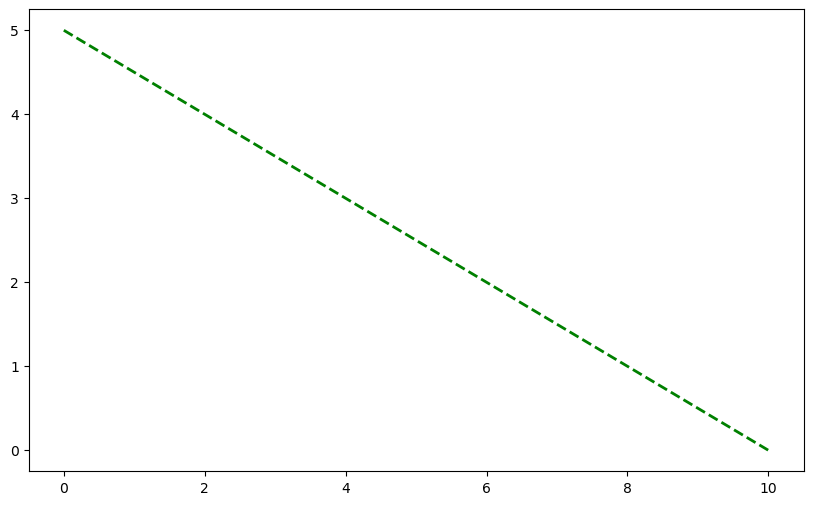
# Multiple reaction orders
# time = np.linspace(0, 10, 100)
C0 = 5.0  # Initial concentration

# Different reaction orders
C_zero_order = C0 - 0.5 * time

# Create plot with different line styles
plt.figure(figsize=(10, 6))
plt.plot(time, C_zero_order, 'g--', linewidth=2, label='Zero Order')
[<matplotlib.lines.Line2D at 0x11c829000>]
import matplotlib.colors as mcolors
print(mcolors.CSS4_COLORS)
print(list(mcolors.CSS4_COLORS.keys()))
{'aliceblue': '#F0F8FF', 'antiquewhite': '#FAEBD7', 'aqua': '#00FFFF', 'aquamarine': '#7FFFD4', 'azure': '#F0FFFF', 'beige': '#F5F5DC', 'bisque': '#FFE4C4', 'black': '#000000', 'blanchedalmond': '#FFEBCD', 'blue': '#0000FF', 'blueviolet': '#8A2BE2', 'brown': '#A52A2A', 'burlywood': '#DEB887', 'cadetblue': '#5F9EA0', 'chartreuse': '#7FFF00', 'chocolate': '#D2691E', 'coral': '#FF7F50', 'cornflowerblue': '#6495ED', 'cornsilk': '#FFF8DC', 'crimson': '#DC143C', 'cyan': '#00FFFF', 'darkblue': '#00008B', 'darkcyan': '#008B8B', 'darkgoldenrod': '#B8860B', 'darkgray': '#A9A9A9', 'darkgreen': '#006400', 'darkgrey': '#A9A9A9', 'darkkhaki': '#BDB76B', 'darkmagenta': '#8B008B', 'darkolivegreen': '#556B2F', 'darkorange': '#FF8C00', 'darkorchid': '#9932CC', 'darkred': '#8B0000', 'darksalmon': '#E9967A', 'darkseagreen': '#8FBC8F', 'darkslateblue': '#483D8B', 'darkslategray': '#2F4F4F', 'darkslategrey': '#2F4F4F', 'darkturquoise': '#00CED1', 'darkviolet': '#9400D3', 'deeppink': '#FF1493', 'deepskyblue': '#00BFFF', 'dimgray': '#696969', 'dimgrey': '#696969', 'dodgerblue': '#1E90FF', 'firebrick': '#B22222', 'floralwhite': '#FFFAF0', 'forestgreen': '#228B22', 'fuchsia': '#FF00FF', 'gainsboro': '#DCDCDC', 'ghostwhite': '#F8F8FF', 'gold': '#FFD700', 'goldenrod': '#DAA520', 'gray': '#808080', 'green': '#008000', 'greenyellow': '#ADFF2F', 'grey': '#808080', 'honeydew': '#F0FFF0', 'hotpink': '#FF69B4', 'indianred': '#CD5C5C', 'indigo': '#4B0082', 'ivory': '#FFFFF0', 'khaki': '#F0E68C', 'lavender': '#E6E6FA', 'lavenderblush': '#FFF0F5', 'lawngreen': '#7CFC00', 'lemonchiffon': '#FFFACD', 'lightblue': '#ADD8E6', 'lightcoral': '#F08080', 'lightcyan': '#E0FFFF', 'lightgoldenrodyellow': '#FAFAD2', 'lightgray': '#D3D3D3', 'lightgreen': '#90EE90', 'lightgrey': '#D3D3D3', 'lightpink': '#FFB6C1', 'lightsalmon': '#FFA07A', 'lightseagreen': '#20B2AA', 'lightskyblue': '#87CEFA', 'lightslategray': '#778899', 'lightslategrey': '#778899', 'lightsteelblue': '#B0C4DE', 'lightyellow': '#FFFFE0', 'lime': '#00FF00', 'limegreen': '#32CD32', 'linen': '#FAF0E6', 'magenta': '#FF00FF', 'maroon': '#800000', 'mediumaquamarine': '#66CDAA', 'mediumblue': '#0000CD', 'mediumorchid': '#BA55D3', 'mediumpurple': '#9370DB', 'mediumseagreen': '#3CB371', 'mediumslateblue': '#7B68EE', 'mediumspringgreen': '#00FA9A', 'mediumturquoise': '#48D1CC', 'mediumvioletred': '#C71585', 'midnightblue': '#191970', 'mintcream': '#F5FFFA', 'mistyrose': '#FFE4E1', 'moccasin': '#FFE4B5', 'navajowhite': '#FFDEAD', 'navy': '#000080', 'oldlace': '#FDF5E6', 'olive': '#808000', 'olivedrab': '#6B8E23', 'orange': '#FFA500', 'orangered': '#FF4500', 'orchid': '#DA70D6', 'palegoldenrod': '#EEE8AA', 'palegreen': '#98FB98', 'paleturquoise': '#AFEEEE', 'palevioletred': '#DB7093', 'papayawhip': '#FFEFD5', 'peachpuff': '#FFDAB9', 'peru': '#CD853F', 'pink': '#FFC0CB', 'plum': '#DDA0DD', 'powderblue': '#B0E0E6', 'purple': '#800080', 'rebeccapurple': '#663399', 'red': '#FF0000', 'rosybrown': '#BC8F8F', 'royalblue': '#4169E1', 'saddlebrown': '#8B4513', 'salmon': '#FA8072', 'sandybrown': '#F4A460', 'seagreen': '#2E8B57', 'seashell': '#FFF5EE', 'sienna': '#A0522D', 'silver': '#C0C0C0', 'skyblue': '#87CEEB', 'slateblue': '#6A5ACD', 'slategray': '#708090', 'slategrey': '#708090', 'snow': '#FFFAFA', 'springgreen': '#00FF7F', 'steelblue': '#4682B4', 'tan': '#D2B48C', 'teal': '#008080', 'thistle': '#D8BFD8', 'tomato': '#FF6347', 'turquoise': '#40E0D0', 'violet': '#EE82EE', 'wheat': '#F5DEB3', 'white': '#FFFFFF', 'whitesmoke': '#F5F5F5', 'yellow': '#FFFF00', 'yellowgreen': '#9ACD32'}
['aliceblue', 'antiquewhite', 'aqua', 'aquamarine', 'azure', 'beige', 'bisque', 'black', 'blanchedalmond', 'blue', 'blueviolet', 'brown', 'burlywood', 'cadetblue', 'chartreuse', 'chocolate', 'coral', 'cornflowerblue', 'cornsilk', 'crimson', 'cyan', 'darkblue', 'darkcyan', 'darkgoldenrod', 'darkgray', 'darkgreen', 'darkgrey', 'darkkhaki', 'darkmagenta', 'darkolivegreen', 'darkorange', 'darkorchid', 'darkred', 'darksalmon', 'darkseagreen', 'darkslateblue', 'darkslategray', 'darkslategrey', 'darkturquoise', 'darkviolet', 'deeppink', 'deepskyblue', 'dimgray', 'dimgrey', 'dodgerblue', 'firebrick', 'floralwhite', 'forestgreen', 'fuchsia', 'gainsboro', 'ghostwhite', 'gold', 'goldenrod', 'gray', 'green', 'greenyellow', 'grey', 'honeydew', 'hotpink', 'indianred', 'indigo', 'ivory', 'khaki', 'lavender', 'lavenderblush', 'lawngreen', 'lemonchiffon', 'lightblue', 'lightcoral', 'lightcyan', 'lightgoldenrodyellow', 'lightgray', 'lightgreen', 'lightgrey', 'lightpink', 'lightsalmon', 'lightseagreen', 'lightskyblue', 'lightslategray', 'lightslategrey', 'lightsteelblue', 'lightyellow', 'lime', 'limegreen', 'linen', 'magenta', 'maroon', 'mediumaquamarine', 'mediumblue', 'mediumorchid', 'mediumpurple', 'mediumseagreen', 'mediumslateblue', 'mediumspringgreen', 'mediumturquoise', 'mediumvioletred', 'midnightblue', 'mintcream', 'mistyrose', 'moccasin', 'navajowhite', 'navy', 'oldlace', 'olive', 'olivedrab', 'orange', 'orangered', 'orchid', 'palegoldenrod', 'palegreen', 'paleturquoise', 'palevioletred', 'papayawhip', 'peachpuff', 'peru', 'pink', 'plum', 'powderblue', 'purple', 'rebeccapurple', 'red', 'rosybrown', 'royalblue', 'saddlebrown', 'salmon', 'sandybrown', 'seagreen', 'seashell', 'sienna', 'silver', 'skyblue', 'slateblue', 'slategray', 'slategrey', 'snow', 'springgreen', 'steelblue', 'tan', 'teal', 'thistle', 'tomato', 'turquoise', 'violet', 'wheat', 'white', 'whitesmoke', 'yellow', 'yellowgreen']
time
array([ 0.        ,  0.1010101 ,  0.2020202 ,  0.3030303 ,  0.4040404 ,
        0.50505051,  0.60606061,  0.70707071,  0.80808081,  0.90909091,
        1.01010101,  1.11111111,  1.21212121,  1.31313131,  1.41414141,
        1.51515152,  1.61616162,  1.71717172,  1.81818182,  1.91919192,
        2.02020202,  2.12121212,  2.22222222,  2.32323232,  2.42424242,
        2.52525253,  2.62626263,  2.72727273,  2.82828283,  2.92929293,
        3.03030303,  3.13131313,  3.23232323,  3.33333333,  3.43434343,
        3.53535354,  3.63636364,  3.73737374,  3.83838384,  3.93939394,
        4.04040404,  4.14141414,  4.24242424,  4.34343434,  4.44444444,
        4.54545455,  4.64646465,  4.74747475,  4.84848485,  4.94949495,
        5.05050505,  5.15151515,  5.25252525,  5.35353535,  5.45454545,
        5.55555556,  5.65656566,  5.75757576,  5.85858586,  5.95959596,
        6.06060606,  6.16161616,  6.26262626,  6.36363636,  6.46464646,
        6.56565657,  6.66666667,  6.76767677,  6.86868687,  6.96969697,
        7.07070707,  7.17171717,  7.27272727,  7.37373737,  7.47474747,
        7.57575758,  7.67676768,  7.77777778,  7.87878788,  7.97979798,
        8.08080808,  8.18181818,  8.28282828,  8.38383838,  8.48484848,
        8.58585859,  8.68686869,  8.78787879,  8.88888889,  8.98989899,
        9.09090909,  9.19191919,  9.29292929,  9.39393939,  9.49494949,
        9.5959596 ,  9.6969697 ,  9.7979798 ,  9.8989899 , 10.        ])
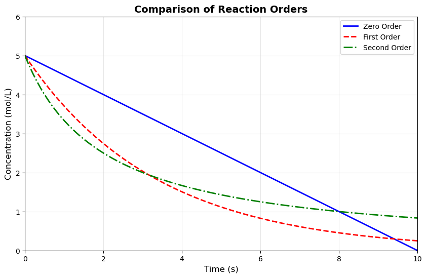
# Multiple reaction orders
# time = np.linspace(0, 10, 100)
C0 = 5.0  # Initial concentration

# Different reaction orders
C_zero_order = C0 - 0.5 * time
C_zero_order[C_zero_order < 0] = 0  # Concentration can't be negative

C_first_order = C0 * np.exp(-0.3 * time)

k2 = 0.1
C_second_order = C0 / (1 + C0 * k2 * time)

# Create plot with different line styles
plt.figure(figsize=(10, 6))
plt.plot(time, C_zero_order, 'b-', linewidth=2, label='Zero Order')
plt.plot(time, C_first_order, 'r--', linewidth=2, label='First Order')
plt.plot(time, C_second_order, 'g-.', linewidth=2, label='Second Order')

plt.xlabel('Time (s)', fontsize=12)
plt.ylabel('Concentration (mol/L)', fontsize=12)
plt.title('Comparison of Reaction Orders', fontsize=14, fontweight='bold')
plt.legend(fontsize=10, loc='upper right')
plt.grid(True, alpha=0.3)
plt.xlim(0, 10)
plt.ylim(0, 6)
plt.show()
9.1.3 Scatter Plots#
plt.scatter(x_data, y_data, linestyling...)
  Cell In[12], line 1
    plt.scatter(x_data, y_data, linestyling...)
                                ^
SyntaxError: invalid syntax. Perhaps you forgot a comma?
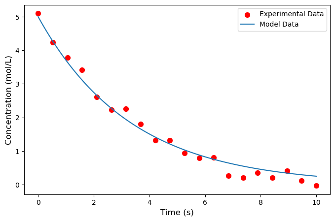
# Experimental data with noise
np.random.seed(42)
time_exp = np.array([ 0.        ,  0.52631579,  1.05263158,  1.57894737,  2.10526316,
        2.63157895,  3.15789474,  3.68421053,  4.21052632,  4.73684211,
        5.26315789,  5.78947368,  6.31578947,  6.84210526,  7.36842105,
        7.89473684,  8.42105263,  8.94736842,  9.47368421, 10.        ])
C_exp = 5.0 * np.exp(-0.3 * time_exp) + np.random.normal(0, 0.2, 20)


time_model = time #np.linspace(0, 10, 100)
C_model = 5.0 * np.exp(-0.3 * time_model)

plt.figure(figsize=(8, 5))
plt.scatter(time_exp, C_exp, s=50, color='red',
            marker='o', label='Experimental Data')
plt.plot(time_model, C_model, label='Model Data')

plt.xlabel('Time (s)', fontsize=12)
plt.ylabel('Concentration (mol/L)', fontsize=12)

plt.legend(fontsize=10)
plt.show()
# Experimental data with noise
np.random.seed(42)
time_exp = np.array([ 0.        ,  0.52631579,  1.05263158,  1.57894737,  2.10526316,
        2.63157895,  3.15789474,  3.68421053,  4.21052632,  4.73684211,
        5.26315789,  5.78947368,  6.31578947,  6.84210526,  7.36842105,
        7.89473684,  8.42105263,  8.94736842,  9.47368421, 10.        ])
C_exp = 5.0 * np.exp(-0.3 * time_exp) + np.random.normal(0, 0.2, 20)

# # Theoretical model
# time_model = time #np.linspace(0, 10, 100)
# C_model = 5.0 * np.exp(-0.3 * time_model)

plt.figure(figsize=(8, 5))
plt.scatter(time_exp, C_exp, s=50, color='red',
            marker='o', label='Experimental Data', zorder=3)
# plt.plot(time_model, C_model, 'b-', linewidth=2,
#          label='Model Fit', zorder=2)

plt.xlabel('Time (s)', fontsize=12)
plt.ylabel('Concentration (mol/L)', fontsize=12)
# plt.title('Model Fitting to Experimental Data', fontsize=14)
plt.legend(fontsize=10)
plt.grid(True, alpha=0.3, zorder=1)
plt.show()
9.1.4 Subplots#
fig, axes = plt.subplots(2, 2, figsize=(12, 10))
axes
array([[<Axes: >, <Axes: >],
       [<Axes: >, <Axes: >],
       [<Axes: >, <Axes: >]], dtype=object)
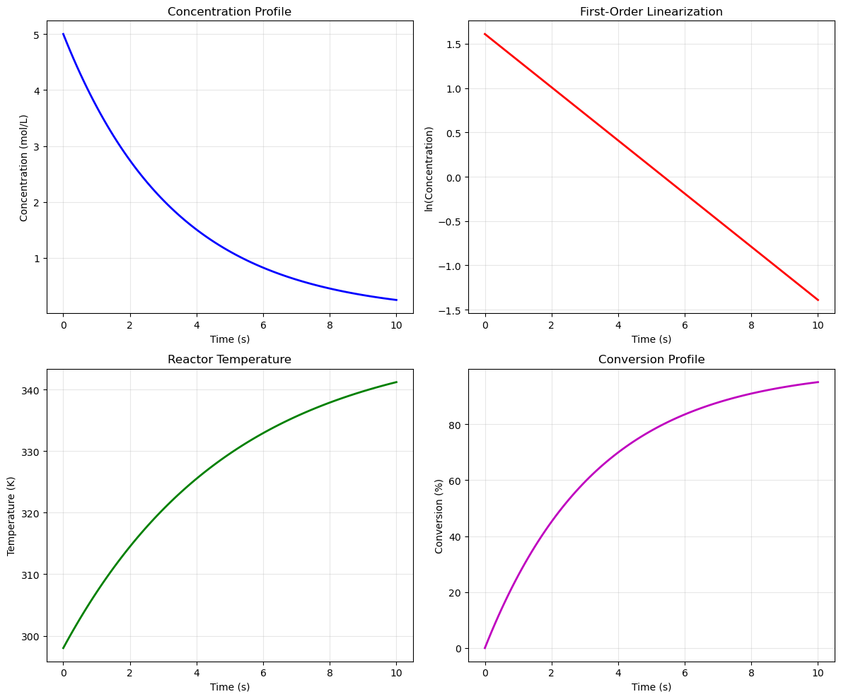
# Create 2x2 subplot layout
fig, axes = plt.subplots(2, 2, figsize=(12, 10))

time = time #np.linspace(0, 10, 100)

# Subplot 1: Concentration vs Time
C = 5.0 * np.exp(-0.3 * time)
axes[0, 0].plot(time, C, 'b-', linewidth=2)
axes[0, 0].set_xlabel('Time (s)')
axes[0, 0].set_ylabel('Concentration (mol/L)')
axes[0, 0].set_title('Concentration Profile')
axes[0, 0].grid(True, alpha=0.3)

# Subplot 2: ln(C) vs Time (linearization)
axes[0, 1].plot(time, np.log(C), 'r-', linewidth=2)
axes[0, 1].set_xlabel('Time (s)')
axes[0, 1].set_ylabel('ln(Concentration)')
axes[0, 1].set_title('First-Order Linearization')
axes[0, 1].grid(True, alpha=0.3)

# Subplot 3: Temperature profile
T = 298 + 50 * (1 - np.exp(-0.2 * time))
axes[1, 0].plot(time, T, 'g-', linewidth=2)
axes[1, 0].set_xlabel('Time (s)')
axes[1, 0].set_ylabel('Temperature (K)')
axes[1, 0].set_title('Reactor Temperature')
axes[1, 0].grid(True, alpha=0.3)

# Subplot 4: Conversion vs Time
X = 1 - np.exp(-0.3 * time)
axes[1, 1].plot(time, X * 100, 'm-', linewidth=2)
axes[1, 1].set_xlabel('Time (s)')
axes[1, 1].set_ylabel('Conversion (%)')
axes[1, 1].set_title('Conversion Profile')
axes[1, 1].grid(True, alpha=0.3)

plt.tight_layout()
plt.show()
9.1.5 Bar Charts and Histograms#
import numpy as np
import matplotlib.pyplot as plt
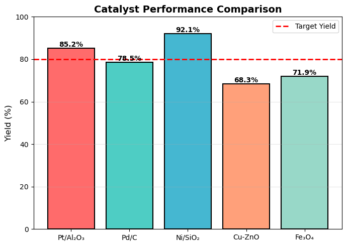
# Yield comparison for different catalysts
catalysts = ['Pt/Al₂O₃', 'Pd/C', 'Ni/SiO₂', 'Cu-ZnO', 'Fe₃O₄']
yields = [85.2, 78.5, 92.1, 68.3, 71.9]
colors = ['#FF6B6B', '#4ECDC4', '#45B7D1', '#FFA07A', '#98D8C8']
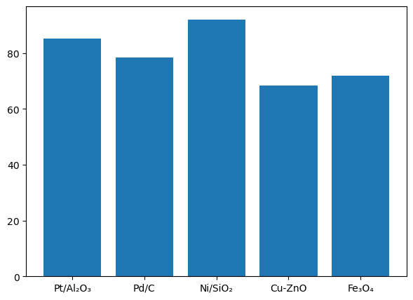
# -------- FIGURE 1: BAR CHART --------
plt.figure(figsize=(7,5))
bars = plt.bar(catalysts, yields)
#color=colors,
#edgecolor='black', linewidth=1.5)
import numpy as np
import matplotlib.pyplot as plt
# Yield comparison for different catalysts
catalysts = ['Pt/Al₂O₃', 'Pd/C', 'Ni/SiO₂', 'Cu-ZnO', 'Fe₃O₄']
yields = [85.2, 78.5, 92.1, 68.3, 71.9]
colors = ['#FF6B6B', '#4ECDC4', '#45B7D1', '#FFA07A', '#98D8C8']

# -------- FIGURE 1: BAR CHART --------
plt.figure(figsize=(7,5))

bars = plt.bar(catalysts, yields, color=colors,
               edgecolor='black', linewidth=1.5)

plt.ylabel('Yield (%)', fontsize=12)
plt.title('Catalyst Performance Comparison', fontsize=14, fontweight='bold')
plt.ylim(0, 100)

plt.axhline(y=80, color='red', linestyle='--',
            linewidth=2, label='Target Yield')

plt.legend()
plt.grid(axis='y', alpha=0.3)

# Add value labels
for bar in bars:
    height = bar.get_height()
    plt.text(bar.get_x() + bar.get_width()/2., height,
             f'{height:.1f}%',
             ha='center', va='bottom', fontsize=10, fontweight='bold')

plt.tight_layout()
plt.show()
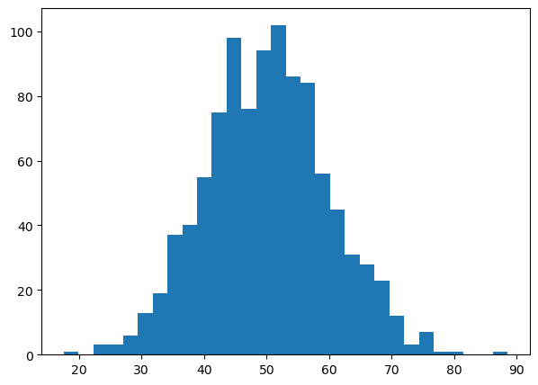
# -------- FIGURE 2: HISTOGRAM --------
np.random.seed(42)
particle_sizes = np.random.normal(50, 10, 1000)

plt.figure(figsize=(7,5))

plt.hist(particle_sizes, bins=30)
    # color='steelblue',
         # edgecolor='black',
         # alpha=0.7)
plt.show()
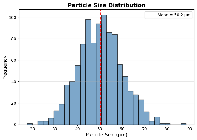
# -------- FIGURE 2: HISTOGRAM --------
np.random.seed(42)
particle_sizes = np.random.normal(50, 10, 1000)

plt.figure(figsize=(7,5))

plt.hist(particle_sizes, bins=30,
         color='steelblue',
         edgecolor='black',
         alpha=0.7)

plt.xlabel('Particle Size (μm)', fontsize=12)
plt.ylabel('Frequency', fontsize=12)
plt.title('Particle Size Distribution', fontsize=14, fontweight='bold')

mean_val = np.mean(particle_sizes)
plt.axvline(x=mean_val, color='red',
            linestyle='--', linewidth=2,
            label=f'Mean = {mean_val:.1f} μm')

plt.legend()
plt.grid(axis='y', alpha=0.3)

plt.tight_layout()
plt.show()
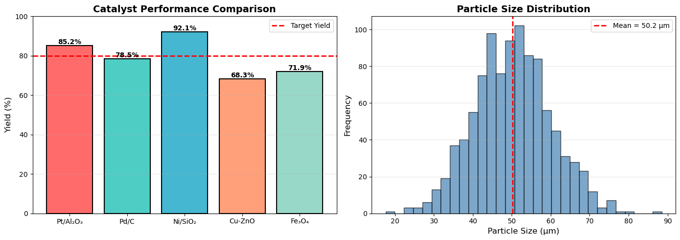
# Yield comparison for different catalysts
catalysts = ['Pt/Al₂O₃', 'Pd/C', 'Ni/SiO₂', 'Cu-ZnO', 'Fe₃O₄']
yields = [85.2, 78.5, 92.1, 68.3, 71.9]
colors = ['#FF6B6B', '#4ECDC4', '#45B7D1', '#FFA07A', '#98D8C8']

fig, (ax1, ax2) = plt.subplots(1, 2, figsize=(14, 5))

# Bar chart
bars = ax1.bar(catalysts, yields, color=colors, edgecolor='black', linewidth=1.5)
ax1.set_ylabel('Yield (%)', fontsize=12)
ax1.set_title('Catalyst Performance Comparison', fontsize=14, fontweight='bold')
ax1.set_ylim(0, 100)
ax1.axhline(y=80, color='red', linestyle='--', linewidth=2, label='Target Yield')
ax1.legend()
ax1.grid(axis='y', alpha=0.3)

# Add value labels on bars
for bar in bars:
    height = bar.get_height()
    ax1.text(bar.get_x() + bar.get_width()/2., height,
            f'{height:.1f}%',
            ha='center', va='bottom', fontsize=10, fontweight='bold')

# Histogram of particle sizes
np.random.seed(42)
particle_sizes = np.random.normal(50, 10, 1000)  # μm

ax2.hist(particle_sizes, bins=30, color='steelblue',
         edgecolor='black', alpha=0.7)
ax2.set_xlabel('Particle Size (μm)', fontsize=12)
ax2.set_ylabel('Frequency', fontsize=12)
ax2.set_title('Particle Size Distribution', fontsize=14, fontweight='bold')
ax2.axvline(x=np.mean(particle_sizes), color='red',
           linestyle='--', linewidth=2, label=f'Mean = {np.mean(particle_sizes):.1f} μm')
ax2.legend()
ax2.grid(axis='y', alpha=0.3)

plt.tight_layout()
plt.show()
9.2 Scientific Plotting for Chemical Engineering#
Scientific plots are not decorations—they are tools for communication. A well-designed figure should allow the reader to:
Understand the scientific message quickly
Interpret trends, comparisons, and uncertainties correctly
Reproduce and verify the results if needed
Poor plotting choices can mislead readers, obscure important trends, or reduce the credibility of your work.
9.2.1 Define the Scientific Question First#
Before making any plot, ask yourself:
What question am I trying to answer?
What relationship am I trying to show?
Who is the audience (yourself, classmates, reviewers, general public)?
The answers determine:
The type of plot
The variables shown
The level of detail required
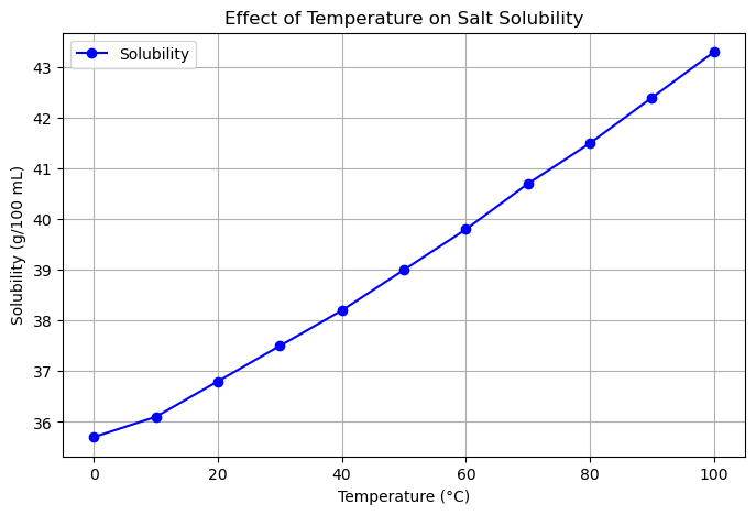
Example 1
Suppose you performed an experiment measuring how temperature affects the solubility of salt in water.
Scientific Question: How does solubility change with temperature?
Relationship to show: Solubility (g/100 mL) vs. Temperature (°C)
Audience: Classmates learning basic chemistry
Decisions for plotting:
Plot type → Line plot (continuous variable: temperature)
X-axis → Temperature (°C)
Y-axis → Solubility (g/100 mL)
Include error bars → If measurements have uncertainty
import matplotlib.pyplot as plt

# Sample data: Temperature (°C) vs Solubility (g/100 mL water)
temperature = [0, 10, 20, 30, 40, 50, 60, 70, 80, 90, 100]
solubility = [35.7, 36.1, 36.8, 37.5, 38.2, 39.0, 39.8, 40.7, 41.5, 42.4, 43.3]

# Create a line plot
plt.figure(figsize=(8,5))
plt.plot(temperature, solubility, marker='o', linestyle='-', color='b', label='Solubility')

# Add labels and title
plt.xlabel('Temperature (°C)')
plt.ylabel('Solubility (g/100 mL)')
plt.title('Effect of Temperature on Salt Solubility')
plt.grid(True)
plt.legend()

# Show the plot
plt.show()
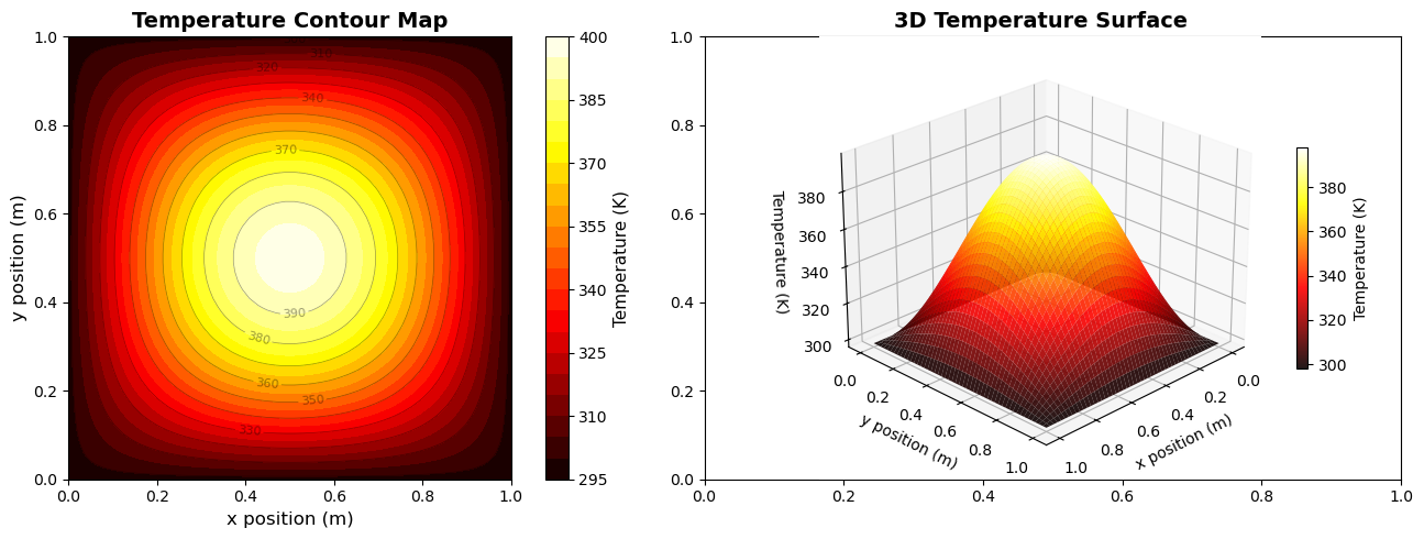
Example 2
Suppose you performed a simulation measuring the temperature distribution across a heated square plate.
Scientific Question: How does temperature vary across the surface of the plate?
Relationship to show: Temperature (K) vs. spatial position (x, y)
Audience: Classmates or lab report readers studying heat transfer
Decisions for plotting:
Plot type → 2D filled contour plot (for regions of similar temperature)
X-axis → x position (m)
Y-axis → y position (m)
Color → Temperature (K) with a colorbar
Contour lines → Optional, for precise values
3D surface plot → Optional, to visualize the shape of the temperature field
# 2D temperature distribution in a heated plate
x = np.linspace(0, 1, 50)
y = np.linspace(0, 1, 50)
X, Y = np.meshgrid(x, y)

# Temperature distribution (simplified heat equation solution)
T = 100 * np.sin(np.pi * X) * np.sin(np.pi * Y) + 298

fig, (ax1, ax2) = plt.subplots(1, 2, figsize=(14, 5))

# Filled contour plot
contourf = ax1.contourf(X, Y, T, levels=20, cmap='hot')
contour_lines = ax1.contour(X, Y, T, levels=10, colors='black',
                            linewidths=0.5, alpha=0.4)
ax1.clabel(contour_lines, inline=True, fontsize=8)
cbar1 = plt.colorbar(contourf, ax=ax1)
cbar1.set_label('Temperature (K)', fontsize=11)
ax1.set_xlabel('x position (m)', fontsize=12)
ax1.set_ylabel('y position (m)', fontsize=12)
ax1.set_title('Temperature Contour Map', fontsize=14, fontweight='bold')
ax1.set_aspect('equal')

# 3D surface plot
from mpl_toolkits.mplot3d import Axes3D
ax2 = fig.add_subplot(122, projection='3d')
surf = ax2.plot_surface(X, Y, T, cmap='hot', edgecolor='none', alpha=0.9)
cbar2 = plt.colorbar(surf, ax=ax2, shrink=0.5)
cbar2.set_label('Temperature (K)', fontsize=10)
ax2.set_xlabel('x position (m)', fontsize=10)
ax2.set_ylabel('y position (m)', fontsize=10)
ax2.set_zlabel('Temperature (K)', fontsize=10)
ax2.set_title('3D Temperature Surface', fontsize=14, fontweight='bold')
ax2.view_init(elev=25, azim=45)

plt.tight_layout()
plt.show()
9.2.2 Axes: Labels, Units, and Scaling#
Proper axis labels, units, and scaling are critical for scientific plots. They ensure the reader can interpret your data accurately and prevent miscommunication.
Axis Labels#
Always label both X and Y axes with the variable name.
Include units in parentheses.
Avoid vague labels such as “Value” or “Data”.
Good Example:
Temperature (°C)
Pressure (Pa)
Time (s)
Bad Example:
Value
Output
Axis Scaling#
Use linear scales by default for straightforward relationships.
Use logarithmic scales when:
The data spans several orders of magnitude.
The relationship is multiplicative or follows a power law.
Always label log axes clearly (e.g., “log₁₀(Concentration)”).
Never distort data by changing axis limits just to exaggerate trends.
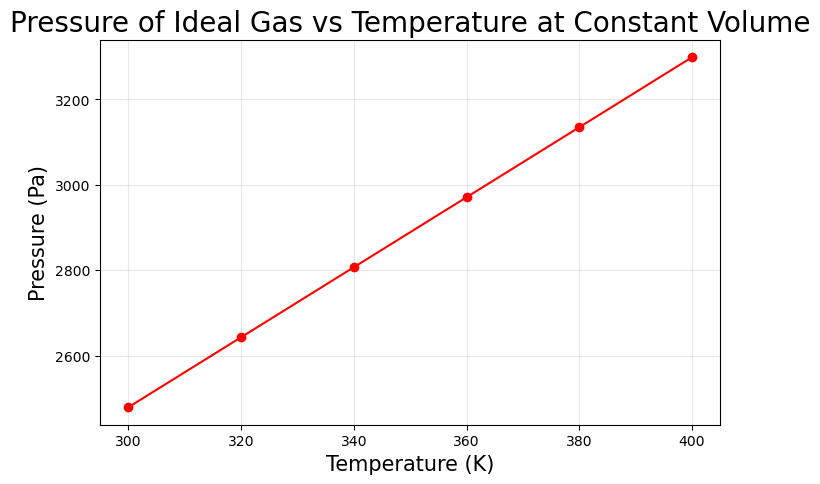
Example: Temperature vs Pressure
Suppose we measure the pressure of an ideal gas at different temperatures in a constant volume container.
Pressure (Pa) = n R T / V
# Python Example: Proper Labels, Units, Scaling
import matplotlib.pyplot as plt

# Sample data (Temperature in K, Pressure in Pa)
temperature = [300, 320, 340, 360, 380, 400]  # Kelvin
pressure = [2478.9, 2642.9, 2807.0, 2971.0, 3135.0, 3299.0]  # Pa

plt.figure(figsize=(8,5))
plt.plot(temperature, pressure, marker='o', linestyle='-', color='r')

# Proper axis labels with units
plt.xlabel('Temperature (K)', fontsize=15)
plt.ylabel('Pressure (Pa)', fontsize=15)
plt.title('Pressure of Ideal Gas vs Temperature at Constant Volume', fontsize=20)
plt.grid(True, alpha=0.3)

# Linear scale by default; log scale example
# plt.yscale('log')  # Uncomment to show log scaling

plt.show()
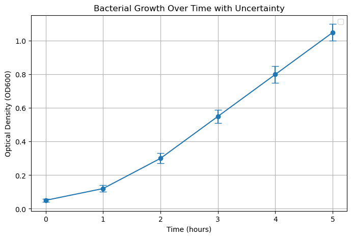
9.2.3 Error Bars and Uncertainty#
In scientific data, uncertainty is always present. It is important to represent it clearly in your plots to communicate the reliability of measurements.
Error bars visually show the variability of the data.
Common types: standard deviation, standard error, confidence intervals.
Always provide a description of what the error represents in your figure caption or legend.
Never hide uncertainty to make results appear more precise or “look better.”
Example: Measuring Growth Rate of a Culture
Suppose we measured bacterial growth (OD600) at different time points, with 3 replicates per time:
time(hours): [0, 1, 2, 3, 4, 5]OD_mean: [0.05, 0.12, 0.30, 0.55, 0.80, 1.05]OD_std: [0.01, 0.02, 0.03, 0.04, 0.05, 0.05] # standard deviation
import matplotlib.pyplot as plt

# Data
time = [0, 1, 2, 3, 4, 5]  # hours
OD_mean = [0.05, 0.12, 0.30, 0.55, 0.80, 1.05]
OD_std = [0.01, 0.02, 0.03, 0.04, 0.05, 0.05]

# Create plot with error bars
plt.figure(figsize=(8,5))
plt.errorbar(time, OD_mean, yerr=OD_std, fmt='o-', capsize=5) #, color='g', label='OD600 ± SD')

# Labels and title
plt.xlabel('Time (hours)')
plt.ylabel('Optical Density (OD600)')
plt.title('Bacterial Growth Over Time with Uncertainty')
plt.grid(True)
plt.legend()

plt.show()
/var/folders/0w/xt4lf1l923l353q32j8pqq000000gn/T/ipykernel_96445/214675294.py:17: UserWarning: No artists with labels found to put in legend.  Note that artists whose label start with an underscore are ignored when legend() is called with no argument.
  plt.legend()
9.3 Molecular Visualization#
Visualization of molecular structures is essential for understanding chemical properties and reactions.
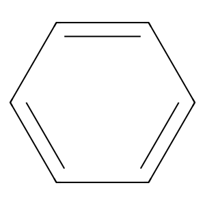
9.3.1 2D Molecular Structures with RDKit#
!pip install rdkit
Requirement already satisfied: rdkit in /Users/hoon/miniconda3/envs/chemcomp/lib/python3.10/site-packages (2025.9.3)
Requirement already satisfied: numpy in /Users/hoon/miniconda3/envs/chemcomp/lib/python3.10/site-packages (from rdkit) (1.26.4)
Requirement already satisfied: Pillow in /Users/hoon/miniconda3/envs/chemcomp/lib/python3.10/site-packages (from rdkit) (12.0.0)
from rdkit import Chem
from rdkit.Chem import Draw

smiles = 'c1ccccc1' # Benzene
mol = Chem.MolFromSmiles(smiles)
img = Draw.MolToImage(mol, size=(300, 300))
display(img)
smiles = 'C=C' # Ethene

mol = Chem.MolFromSmiles(smiles)
img = Draw.MolToImage(mol, size=(300, 300))
display(img)
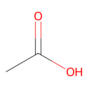
smiles = 'CC(=O)O' # Acetic acid

mol = Chem.MolFromSmiles(smiles)
img = Draw.MolToImage(mol, size=(300, 300))
display(img)
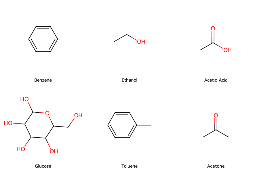
# Common chemical engineering molecules
molecules = {
    'Benzene': 'c1ccccc1',
    'Ethanol': 'CCO',
    'Acetic Acid': 'CC(=O)O',
    'Glucose': 'C(C1C(C(C(C(O1)O)O)O)O)O',
    'Toluene': 'Cc1ccccc1',
    'Acetone': 'CC(=O)C'
}

# Create molecule objects
mols = [Chem.MolFromSmiles(smiles) for smiles in molecules.values()]
legends = list(molecules.keys())

# Draw molecules in a grid
img = Draw.MolsToGridImage(mols, molsPerRow=3, subImgSize=(300, 300),
                           legends=legends, returnPNG=False)
display(img)
9.3.2 3D Molecular Visualization with Py3Dmol#
!pip install py3Dmol
Requirement already satisfied: py3Dmol in /Users/hoon/miniconda3/envs/chemcomp/lib/python3.10/site-packages (2.5.3)
import py3Dmol
from rdkit import Chem
from rdkit.Chem import AllChem

# Create a 3D molecule (ethanol)
smiles = 'CCO'  # Ethanol
mol = Chem.MolFromSmiles(smiles)
mol = Chem.AddHs(mol)

# Generate 3D coordinates
AllChem.EmbedMolecule(mol, randomSeed=42)
AllChem.MMFFOptimizeMolecule(mol)

# Convert to mol block format
mol_block = Chem.MolToMolBlock(mol)

# Create 3D viewer
viewer = py3Dmol.view(width=600, height=400)
viewer.addModel(mol_block, 'mol')

# # Set style
viewer.setStyle({'stick': {'radius': 0.15},
                'sphere': {'radius': 0.4}})
# viewer.setBackgroundColor('white')
viewer.zoomTo()
3Dmol.js failed to load for some reason. Please check your browser console for error messages.
<py3Dmol.view at 0x106edf940>
import py3Dmol
from rdkit import Chem
from rdkit.Chem import AllChem

# Create a 3D molecule (ethanol)
smiles = 'CCO'  # Ethanol
mol = Chem.MolFromSmiles(smiles)
mol = Chem.AddHs(mol)

# Generate 3D coordinates
AllChem.EmbedMolecule(mol, randomSeed=42)
AllChem.MMFFOptimizeMolecule(mol)

# Convert to mol block format
mol_block = Chem.MolToMolBlock(mol)

# Create 3D viewer
viewer = py3Dmol.view(width=600, height=400)
viewer.addModel(mol_block, 'mol')

# # Set style
viewer.setStyle({'stick': {'radius': 0.15},
                'sphere': {'radius': 0.4}})
# viewer.setBackgroundColor('white')
viewer.zoomTo()
3Dmol.js failed to load for some reason. Please check your browser console for error messages.
<py3Dmol.view at 0x10e8dbd60>
# Create a 3D molecule (benzene)
smiles = 'c1ccccc1'  # Benzene
mol = Chem.MolFromSmiles(smiles)
mol = Chem.AddHs(mol)

# Generate 3D coordinates
AllChem.EmbedMolecule(mol, randomSeed=42)
AllChem.MMFFOptimizeMolecule(mol)

# Convert to mol block format
mol_block = Chem.MolToMolBlock(mol)

# Create 3D viewer
viewer = py3Dmol.view(width=600, height=400)
viewer.addModel(mol_block, 'mol')

# # Set style
viewer.setStyle({'stick': {'radius': 0.15},
                'sphere': {'radius': 0.4}})
# viewer.setBackgroundColor('white')
viewer.zoomTo()
3Dmol.js failed to load for some reason. Please check your browser console for error messages.
<py3Dmol.view at 0x10e88fc70>
Key Takeaways:
Good visualizations communicate data clearly and effectively
Choose the right plot type for your data and message
Always label axes with units
Use color and style strategically
Make plots publication-ready with proper formatting